


- Home

- Blog
- Technical SEO
- 7 Tips for Better Information Architecture on Your Website
7 Tips for Better Information Architecture on Your Website
Just as traditional architecture determines how people will use a building or another structure, information architecture (IA) guides users in how they use information systems. And while […]
Just as traditional architecture determines how people will use a building or another structure, information architecture (IA) guides users in how they use information systems. And while there are many information systems out there, the most commonly used are websites.
Unlike the architecture of bridges and buildings, though, information architecture has more moving parts, a more abstract form of ‘building materials,’ and has only been around for a few decades. Additionally, information systems like websites are more malleable and can be adjusted and improved over time.
If you can master the principles of information architecture, you can build a website that will stand the test of time. Whether you’re in the process of creating your website or want to revamp your user experience and content, this article will provide you insight into how you can transform your website into a shining example of well-designed information architecture.
What Is Information Architecture in Relation to a Website?

Information architecture refers to the process your users go through to gather information about your products or services through a website or other digital platform like an app. Information architecture provides people with a systematic way to navigate from point A to point B in order to achieve an action or gain knowledge. In other words, better information architecture promotes easier accessibility of information through intuitive navigation design.
The best information architecture not only streamlines the user’s journey and goals, but it fulfills specific user needs by organizing a vast amount of information into little, easily digestible categories.
From Where Does Information Architecture Originate?
Much of the methodologies, techniques, and principles used to understand and improve information architecture design come from Peter Morville. Morville is the founding architect of this branch of user experience (UX) and content inventory systems. While he was the first, there is a large number of experts in this discipline who develop IA best practices through the Information Architecture Institute and user research.
What Elements Does Information Architecture Include?
Before we dive into how to improve your information architecture, it’s important to have a good sense of what is included in this field of study in relation to your website. While information architecture can apply to library science, spreadsheet science, and even physical structures, we will be focusing on IA in relation to websites.
So where can you find examples of information architecture on a website?
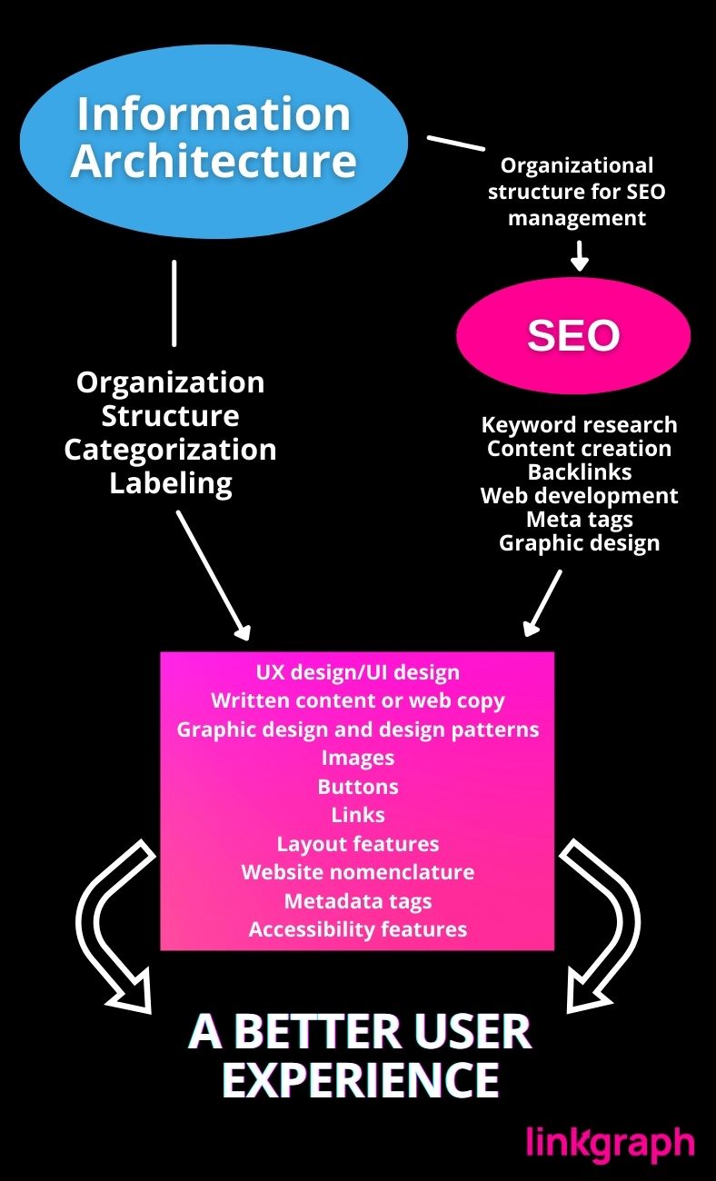
All it takes is for a website to load in order to be flooded with examples of information architecture. Information architecture is the strategic organization and presentation of your website’s content. In fact, nearly every aspect of a website and web design is part of IA. Of course, there is good information architecture and subpar IA, but all of the following are important parts of an IA system that go into your site:
- UX design/UI design
- Written content or web cop
- Graphic design and design patterns
- Images
- Buttons
- Links
- Layout features
- Website nomenclature
- Metadata tags
- Accessibility features
Good IA comes into play in all of the above. And these elements are often categorized into UX design, content creation strategy, and homepage layout (UI design).
How Do Information Architecture and SEO Work Together?
Search engine optimization (SEO) and information architecture both benefit website owners and web users by improving the internet experience. SEO and IA make quality content easier to find, understand, and navigate. SEO and IA differ in where they fit into the website creation process.
Good IA Supports SEO
SEO has the goal of increasing a website’s visibility through the science of configuring content, front-end web development, and back-end web development in response to search engine algorithms. The result is a website that search engines can find and display as search results to web users’ inquiries. This is an ongoing process. SEO requires a proactive and reactive approach since algorithms often change. Additionally, search engines see value to websites that regularly update their content.
SEO specialists regularly improve a website’s
- Written content
- Loading speed & responsiveness
- Organization
- Visual design
- Graphics and photos
Information architecture often works best when established before active web design begins. IA establishes a framework that supports the efforts of SEO specialists for the lifetime of a website. With a well-strategized IA, a website will have a strong foundation of logical organization. This makes a website more enjoyable from the user’s perspective since they can find what they need easily. In turn, this improves the website’s reputation. A better reputation increases the website’s authority and pushes it higher on search engine results pages, so more people can find it.
Good information architecture only as to be designed once.
Like most systems, the best IA only has to be designed once. If an IA system is effective, it will allow a website to scale and respond to changes needed for the most current SEO strategies. As more blogs, products, or landing pages are added to a website for SEO, good IA already has a designated location and system to handle them.
Why is Information Architecture Important in UX?

As your local librarians will tell you, providing easy access to information is priceless. Information is both empowering and vital for the best individual experience and a better society. However, when it comes to your UX, IA has a more specific importance. It increases your brand’s value to potential clients while bolstering your sales.
Good IA structure based on set principles has the power to help people find what they are looking for within seconds. One of the simplest examples of this is concise and accurate folder labels in your Google Drive. This naming or navigation system allows you to access the files and information you’re looking for quickly and effortlessly–leading to less frustration and wasted time.
While more complicated, Google Maps also uses IA to help people find what they’re looking for in the physical world. For instance, if you type “food near me,” your search results will be full of nearby restaurants. This demonstration of IA is a perfect example of what it means to help a user understand what they are looking for since the user is likely looking for businesses that provide food.
How to Improve Your Information Architecture
Improving your information architecture can turn your website from an ordinary e-commerce page into a resource visitors enjoy using. These tips can guide you through how to improve your IA and help you prioritize which tasks to begin with.
1. Utilize wireframes in the prototype stages of your sitemap and IA design development.
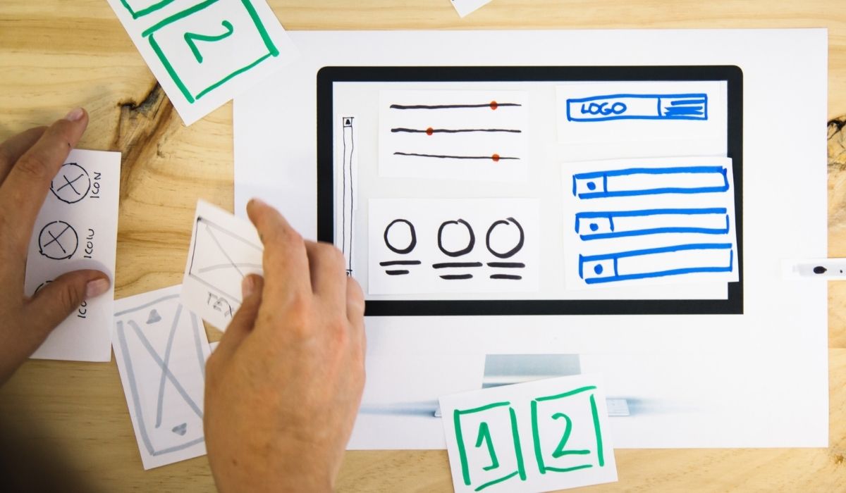
Wireframes serve a multitude of purposes when it comes to developing strong IA and a sitemap. They work superbly as information architecture diagrams that can be moved around and changed before your design is finalized.
At their very core, wireframes connect your IA to its UX design. In striking similarity to an architectural blueprint, a wireframe functions as a skeletal outline of a site or mobile app. However, this method of UX development is not limited to visual design, unlike a mockup. To accurately determine the logic of your site’s flow and the intended customer journey, this is a necessary step in your IA project timeline. Your site’s intended functions can best be evaluated through wireframing.
Through wireframing, you will have a solid idea of your visual hierarchy when you are ready to move your site to the content strategy phase. Common elements of a wireframe include
- Search fields
- Breadcrumbs
- navigation systems
- Headers and footers.
Ideally, you would use wireframes during your initial UX/UI design process. However, you can still utilize them on an existing website.
Identify Paths with Wireframes
Aside from assessing functionality, wireframing is a particularly useful method of identifying paths between web pages. This critical phase of the IA process will allow you to visualize how much space should be allocated for specific content.
When Prototyping Your Visual Hierarchy, Start with a Sketch
Low-fidelity wireframe versions of a website are quick to develop and more abstract because their main focus is on the visual hierarchy of your site. These bare-bones prototypes often implement mock content (like Latin text) as filler for spatial visualization. However, they provide you with a guideline for content volume when the time comes.
Linking concepts to tangible images and links can be a complicated process, even for the seasoned designer. If you have trouble getting your ideas to match your result, consider implementing a mind mapping software like XMind. XMind is a productivity tool used professionally to solidify brainstorming.
Move from Broad to Detailed Wireframes

Conversely, high-fidelity wireframes are more detailed versions are excellent blueprints for interaction design. They include metadata about a particular page element, like its behavior or dimensions. These more detailed versions are excellent blueprints for previewing your interaction design.
2. Keep your brand personas in mind throughout the UX design and content strategy process.

Unity and consistency across your brand are integral parts of a solid information architectural system.
Your site is a reflection of your brand, from the elements of your visual design down to each blog post and product page. Accordingly, you should be keeping your brand personas in mind each time you implement a UX feature or post a new content piece. This ensures fidelity between your company and your target audience. Use your personas as a guide to help you, your design team, and your content strategist collaborate on your ideal user perception.
Define and Implement Your Goal User Perception
Your goal user perception is the way you would like customers or potential customers to view your brand. Before making one of the many decisions IA requires, run your ideas through this line of questioning:
- Does this align with the image I want to create for my brand?
- Will this decision affect consistency across my site or organization?
- Am I appropriately conveying the good qualities of my business?
- Does this get us closer to our main goal?
- How does this project fit into the future of our company?
Any content or design elements that do not hold up to this line of questioning can be eliminated. Not only can this process help you avoid inconsistencies, but it reduces the possibility of having too much content on your site. This benefits your web admins, especially those who keep up with content creation for SEO purposes.
3. Your visual hierarchy determines readability, so prioritize your content accordingly.

Visual hierarchy is a principle of laying out and sizing visual elements to denote their importance to the viewer. For example, alignment, texture, whitespace, and contrast are a few of the visual design concepts that can help draw users’ attention to the right content. An effective user interface design does more than simply provide information. A quality hierarchy can persuade and impress users.
There are a few aspects of visual hierarchy that are highly beneficial to apply when creating UX design based on cognitive psychology.
Visual Hierarchy Principles to Keep in Mind:
1: Larger images are perceived as more important
2: Bright colors garner more attention
3: Elements that are aligned are more pleasing to the eye
4: Higher contrast demands more attention
5: Repetition tells the viewer that elements are related
6: Proximity (or closeness) denotes interconnectedness in topic
7: More white space around an element draws more attention to it
Visual unity isn’t just essential to your brand image, it is also a critical part of your UX design. Familiar colors, menu hierarchies, and diagrams promote consistency and fluid usability. Even small distractions like slow-loading graphics or unaligned text columns can interrupt the user experience.
There are several useful IA software that can assist you in your UI development process, like OmniGraffle. OmniGraffle is used to create visuals and graphics for use in prototypes and mockups. As mentioned above, high-fidelity site frameworks utilize these types of visuals and graphics to help designers strategize where to put information and why it belongs there.
Visual Tidiness Affects More Than Just Usability
If you have ever been to a site that was unattractive, cluttered, or disorganized, you likely formulated a negative opinion of that business or organization. Perhaps you even deemed the information to be less reputable due to the nature or design of the site. This is why it’s important to stick to simplistic and user-friendly design. Together, a pleasant UX and UI can boost user confidence and solidify your site’s credibility.
In addition to building trust among your users, a quality UX also lets Google and other search engines know that your site is worthy of ranking.
4. Structure and categorization are fundamental.
One mistake many people make is putting their content all in one place. In fact, overstuffing information into a single URL causes your UI to suffer, since there is no hierarchy or sense of organization. Too much information on a single page takes users much longer to sort through content to find a specific piece of information.
Users should be able to locate all desired information on your website quickly and easily. This requires a well-planned site map.

Category is… A Better User Experience
To create a better structure, you must first go through the process of categorization. Categorization is the process of organizing your content into a taxonomy system. Categorization is an integral part of navigation design because it has the ability to guide the user to the right content.
Start by Finding Commonalities
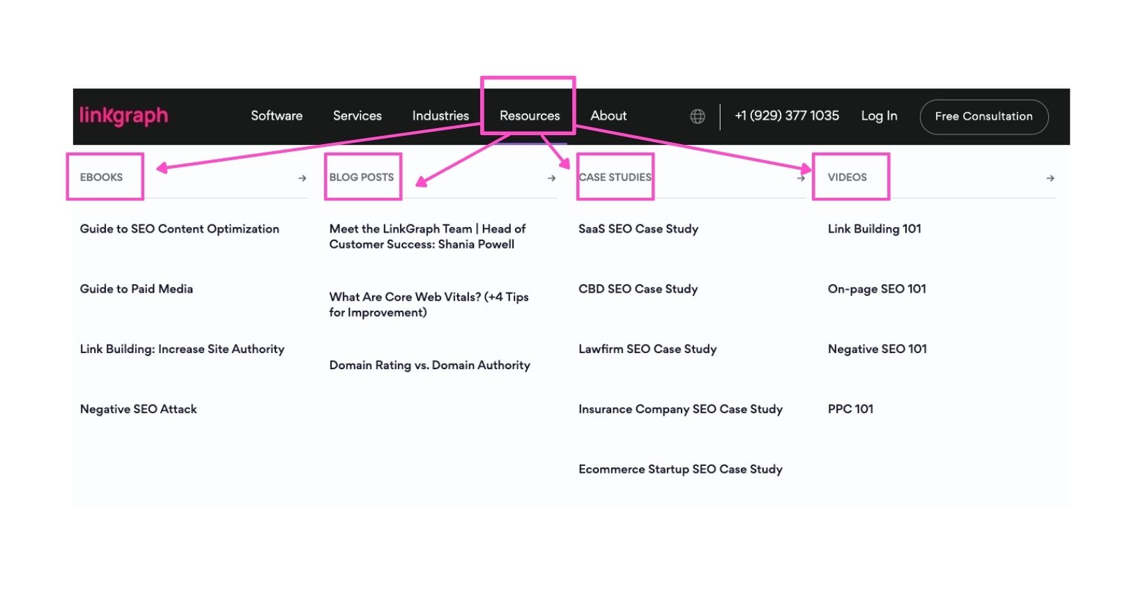
Begin by grouping your content by similarities in content type. For example, in the image above, you will notice, at LinkGraph, we group our resources by format type (eBooks, blog posts, case studies, and videos).
The most common similarities should be land higher on your sitemap since they’re usually the starting place for narrowing down the user flow for optimal navigation.

For example, if your website centers on pet care, you likely will want to first group your products or articles by pet species. From there, you may want to divide the information or products into what aspect of care they provide. As you can see, this would make navigation easier for cat owners looking for a technique or clippers to trim their cat’s nails.
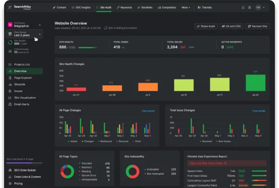
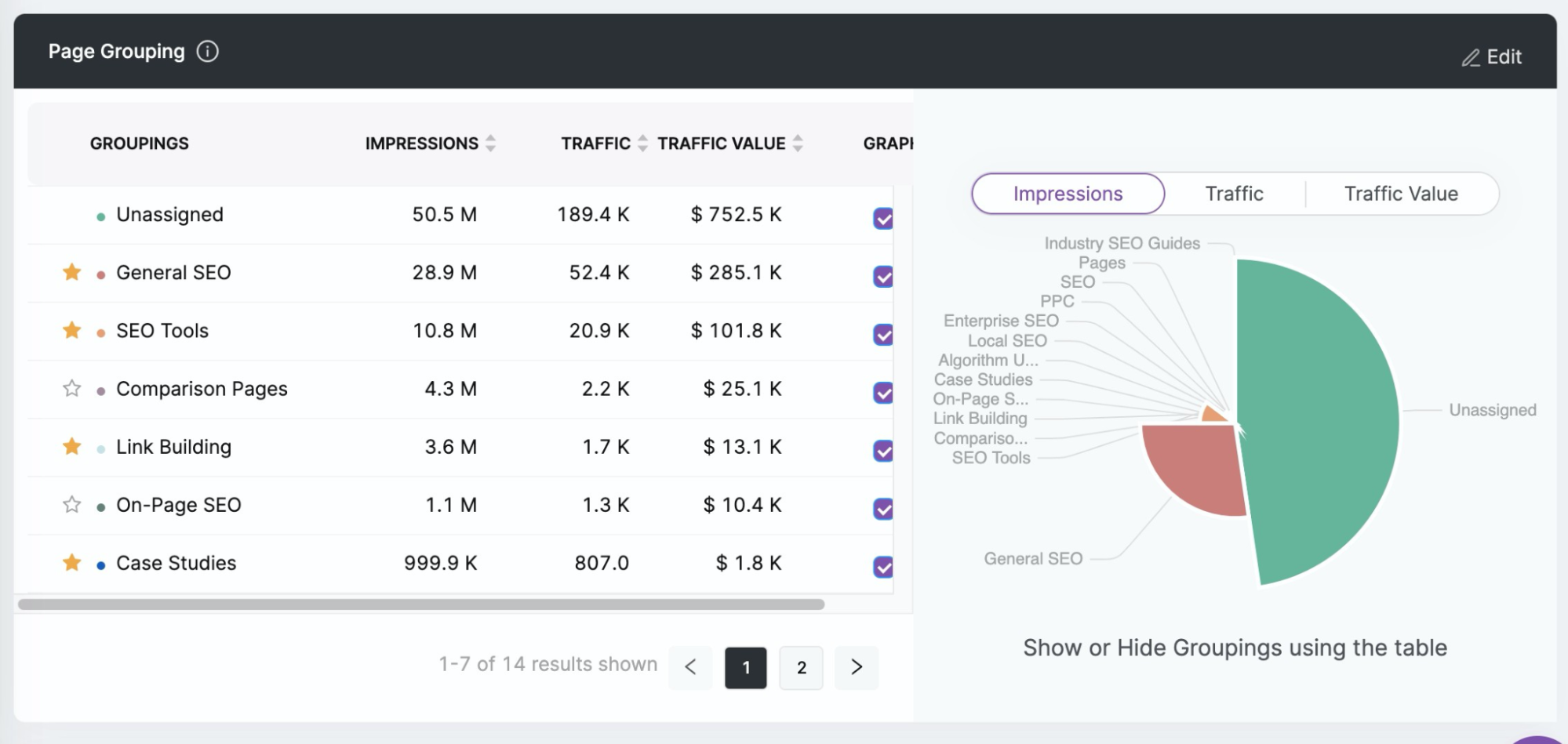
Using tools like Search Atlas can make long-term organization easier by allowing you to group pages into categories. This allows you to see the category performance, so you can target where you can eliminate or improve content.
Eliminate Unnecessary Content and Categories
While generating new content is extremely important, making sure you have room for this content on your site is also essential. It can be tempting to hold onto content that you have created, but it is best to let it go to make room for site updates.
Omitting unnecessary or irrelevant data can also enhance the user experience. So, don’t be shy to perform a content audit and delete pages that receive little-to-no traffic. A potential customer looking for a specific piece of information may become frustrated or lose interest in your digital product if it is too difficult to find.
5. Your homepage shouldn’t be the only local navigation point.

While the ideal destination page is the homepage, users find nearly endless different ways to land on a website. For this reason, the digital design of each page on your website should share the same functions as your homepage.
Your website will likely be backlinked on other websites to enhance reputability and SERP ranking when your business begins implementing a content strategy. Since backlinking incorporates relevant keywords that may bring visitors directly to content, such as blogs or guides, you should ensure that every entry point of your website is equally user-friendly and visually appealing as the homepage in order to make a good first impression and move visitors beyond the landing page.
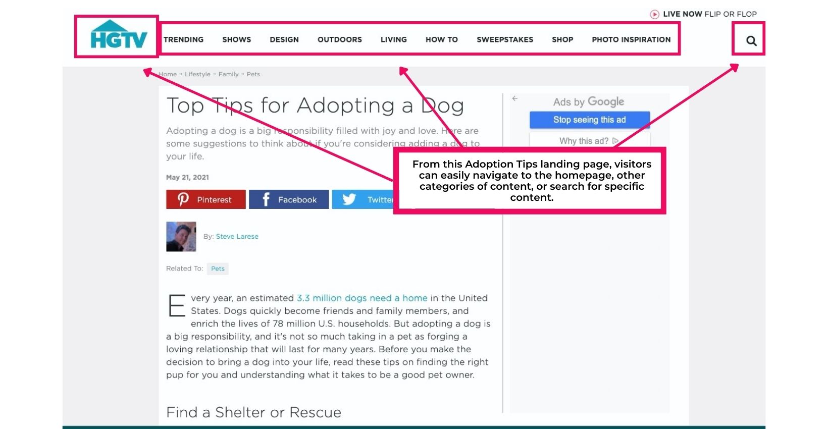
Alt: A landing page for HGTV on tips for adopting a dog. A pink box around the navigation menu.
For example, if a user enters your site through the contact page URL, it should be easy for them to find navigation elements that will take them to the homepage or digital product browsing section.
Provide tools to make finding resources easier
An efficient search system is the backbone of a great user interaction design. This allows an of your webpage participants to find what they’re seeking in seconds rather than minutes.
Provide FAQs with links to more specific information. This gives users the choice of how much information they need and an easy way to access it.
Keep a navigation menu at the top of all your subpages. Subpages need to provide access points for other activities you offer–Otherwise, your users may never travel from a subpage to your sales funnel (or another offering on your main page).
6. Go through the customer journey then map out a blueprint for improvements

Alt: Two caucasian women sitting side by side with a laptop between, going through the customer journey
The best usability testing you can perform is going through the actions of a potential customer. You can do this yourself by going through your website manually. Mind maps can also make the task of mapping the customer journey easy.
For best results, anticipate how a user will engage with your interaction design. Once you have a clear blueprint of your users’ needs, you can create an information hierarchy and a sitemap. Your sitemap allows Google’s bots to crawl your URLs to identify information used for SERPs.
Keep Speed In Mind
In general, the online community values convenience and speed above all. A recent UX study demonstrated that 53% of visits are abandoned if a mobile app or site takes longer than three seconds to load. This means from decision points, your web design has about 3 seconds to sort and present the piece of information digital product the user is looking for.
This is to say that load time, page speed, and click response are essential parts of your information architecture and it is important to keep up with their performance. Thankfully, tools like the
Artificial Intelligence and the Customer Journey
The behavior of an internet user is relatively predictable, and artificial intelligence technology can now mimic user activity for rapid results from AI user testing and other usability testing efforts. In conjunction with heatmaps, you can pinpoint where users tend to get hung up and turn decision points into exit points.
Perform Regular Performance Audits and Fixes
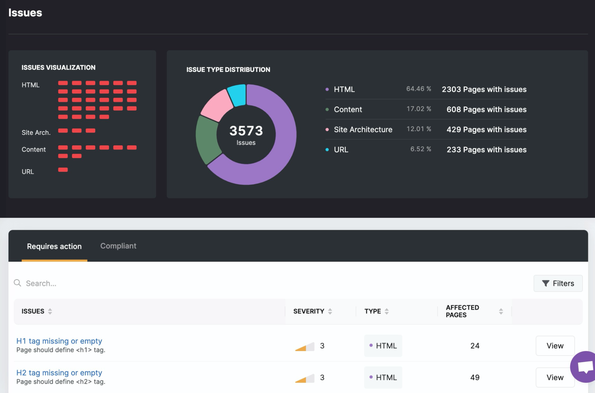
Search Atlas can make tracking and monitoring performance simple once your site is live. This can help you improve the customer journey by identifying navigation issues such as broken links.
Identify What Pages Visitors Use Most with GSC Insights

Finding which pages on your site that visitors utilize most can help you prioritize their functionality when auditing your site’s performance. This also gives you insight into which categories of content your target audience is most interested in.
7. Make sure the information part of your information architecture is high quality.

Findability, usability, and graphic design are all essential elements to good IA. However, the content you are managing needs to be as relevant as it is organized. The same way an information architect is well-versed in the science of organization, content strategists and content creators are experts in SEO and how to improve the content structures.
Reader engagement is a must when it comes to engagement time and scroll distance. The easiest way to improve your content to encourage deeper navigation is with clear headings as a road map to your content. The first thing many visitors will do is preview your headings and images for relevance to their search terms.
The quality of your metadata and headings will also drive more visitors to your site and reduce your bounce rate.
Structure Your Content for Usability and SEO
The Core Web Vital update made the structure of content an even higher priority. This change takes into account how long it takes for users to access the most important aspects of your website. The difference is now most IA design locates data-heavy elements below the page fold. And if these elements are vital assets to your brand, you need to give visitors a reason to scroll through pieces of content far enough to move beyond the fold. This is where the quality of your content comes in.
Information Architecture: The Science of Organizing the Customer Journey
The impact of well-strategized information architecture continues to become more and more profound. With information architects, UX experts, and content auditors, websites are better able to provide every user with easier access to their desired outcomes. Through the science of user behavior, cognitive psychology-based UI design, and strict hierarchy patterns, IA is improving the internet for all users.
Better IA can set your business apart from the competition. With LinkGraph’s team of visual designers, content curators and creators, and UX web developers you can turn your site into a top-performing contender on search engines, the worldwide web, and among your loyal base of customers. If you’re ready to watch your business grow, we’re ready to take on your next project.